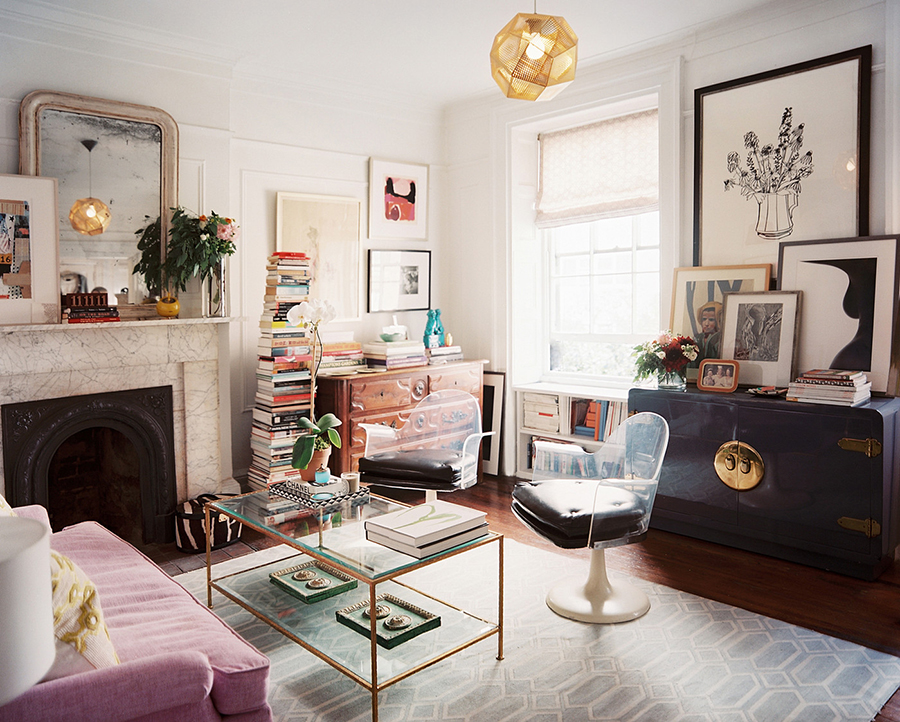
While we may wistfully look at some grand rooms with soaring ceilings and enough space to have a party for 70 in our favourite interior design magazines, the truth is, most of us live in much more modest spaces.
In fact, the average size of a home in Britain is shrinking. New builds are the worst offenders which on average, are now 2 square metres smaller than they were just 10 years ago. A report by the Royal Institute of British Architects showed that the average 1 bedroom home is only 46 square metres and a 3 bedroom home is only 88 square meters. Both fall short (4 sqm and 8 sqm, respectively) of their recommended minimum home size.
For those who live in flats, the reality is even harsher as more and more of us are trying to squeeze a normal lifestyle into smaller and smaller quarters. The number of families now living in flats increased by a whopping 25% from 2008 to 2013.
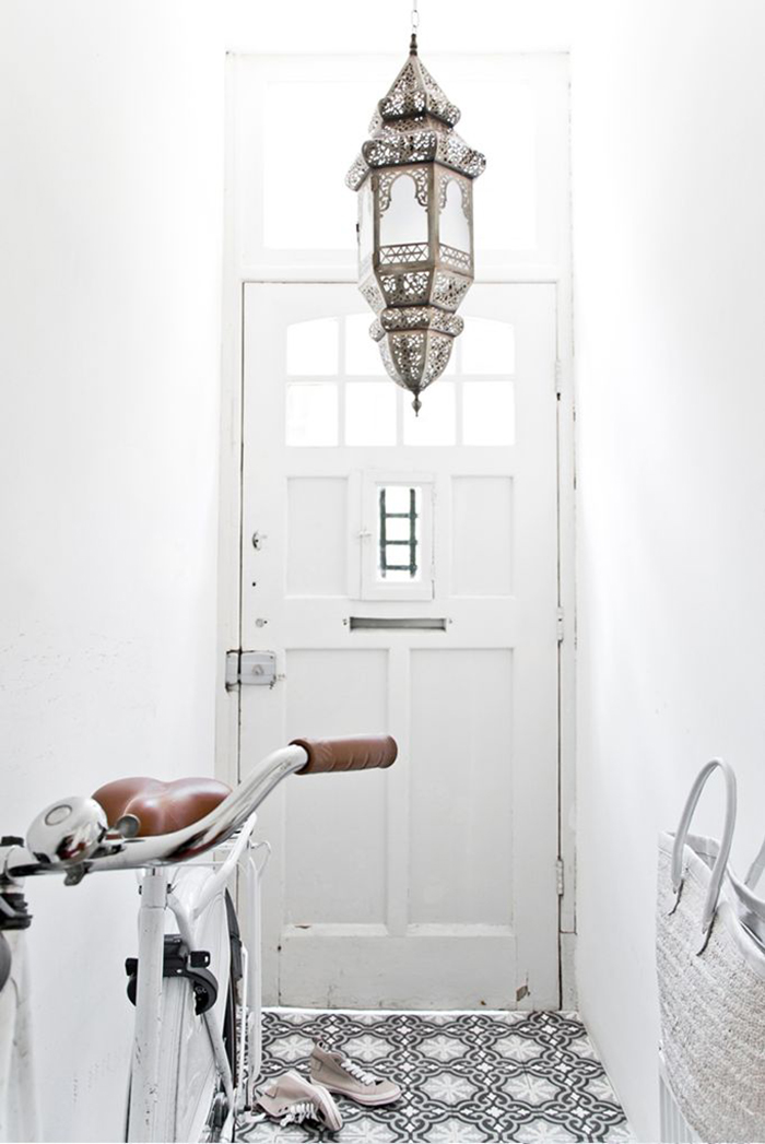
And for those of us living in the ‘average’ 3 bedroom semi-detached home, around 1 in 5 of us have been forced to make use of any additional space they have – converting lofts, cellars and garages into useable living space.
Thankfully there are tricks that interior designers have been utilising for years to make smaller spaces appear larger – both visually as well as functionally and these are tips that nearly anyone who finds themselves outgrowing their own space when it comes to changes in our lives. You may need to carve out additional office space to work from home, you may be expecting a new baby or you may be joining the ranks of a generation of adults whose parents have moved in to care for them in their older years.
So when choosing how to decorate your home to take into consideration the changing needs of your family or situation, it’s important to ensure your space works for you. My post today will take you through a few things you can try to make the best of the space you have, utilising it to the full and visually creating what will appear to be a larger space even if you can’t take down a wall or add that extension!
I believe strongly that our home can make us feel a certain way – whether that’s being filled with a sense of security and familiarity or warmed by the memories we make there – there is much to be said about the psychology of home. When the space around us feels cramped, we lose some of those good qualities and feel a bit claustrophobic. So visually creating what appears to be a larger room can promote the feelings of freedom, openness and space that we value.
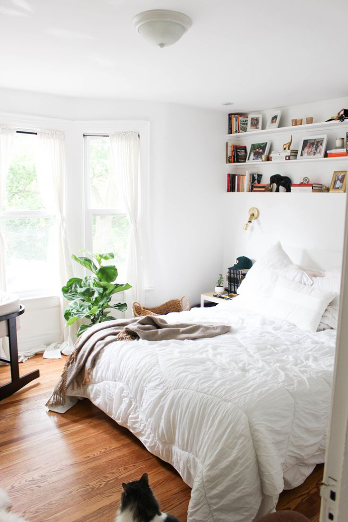
When planning a room design, the first step that any interior designer will employ is to measure of the space you have – this takes into consideration where windows and doors are, electrical outlets, ceiling heights and any other architectural details that would be difficult to change. Working with these measurements keeps you from making a very easy mistake – buying furniture that is much too large and not having the room to actually use it!
So if you are planning on some furniture purchases, take the time to measure where these items will be going. It may be that the L-shaped sofa that looked great in the enormous showroom of your favourite retailer will never fit through the door of your Victorian two up – two down! One of the easiest ways to do this is to use masking tape on the floor to measure up where something will go before purchasing it.
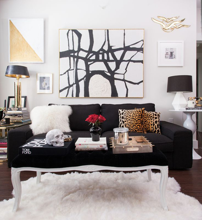
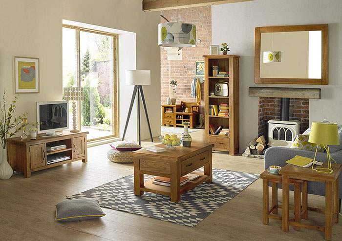
Can you walk around the item? Is it blocking any doors from opening or is it sitting up against a radiator? Can you still open the window nearby? Is there still a traffic flow from one room to the other? It may be that your chosen sofa, table or chest of drawers is simply too large – in this case, it’s almost always better to scale down the size of your furniture to fit. Visually, this allows more ‘negative space’ around your room, psychologically making the room look larger. Functionally, you’ll get better use of the space when you can actually walk around in it! Consider smaller scaled pieces such as found in our very own Barham Oak range. These pieces are perfectly scaled for maximum storage in a more petite size.
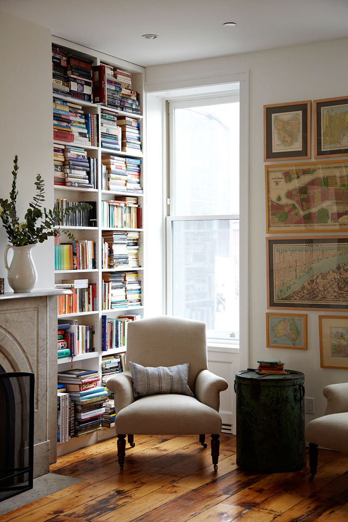
Utilising any square space available is vital in small scale living. If you are a bibliophile, consider built in shelving to use vertical wall space or an alcove to create a small home office.
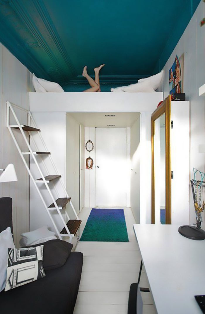
Remember pieces are multifunctional, too. A chest may do double duty as a coffee table, a day bed as a sofa can become a place for guests to sleep and trundle beds can be perfect for the kid’s sleepovers. Having a dining table where you can remove or fold down leaves when it’s not required to be at full size will also save on much needed space. Look to some architecturally creative ideas in small-space living where every available space is used for inspiration.
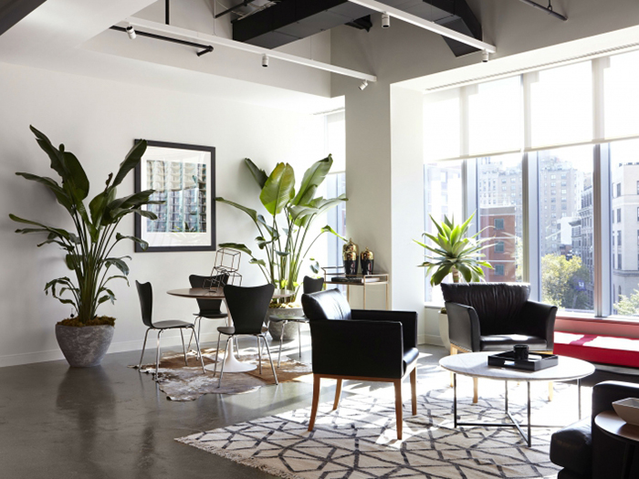
One other idea is to use furniture that stands up on legs. When you can see under furniture, your eye is drawn to the idea that the floor space is actually larger than it is. Combining a number of pieces with tall legs is a great way to visually increase the size of your room.
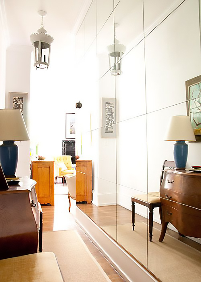
A simple trick to employ is the use of mirrors. Mirrors will visually double the width of any room with its reflection, giving a sense of the room being much grander than it is. It also bounces light around, reflecting back the light that falls on it – and a light, bright space is something many homeowners are keen to have.
To make ceiling heights appear higher and grander, consider another visual trick by hanging curtains all the way from the ceiling to the floor. Your eye will be drawn upwards, creating the illusion of more height. Too-short curtains (ones which do not hit the floor) will interrupt your eye, making a room look squatter so don’t fall into the trap of using curtains that go only to the windowsill. Ensure you hang them all the way to the ceiling and to either side of your window by at least 6-12 inches. This way, when you draw back the curtain, the entire window is exposed, allowing as much light into the room as possible.
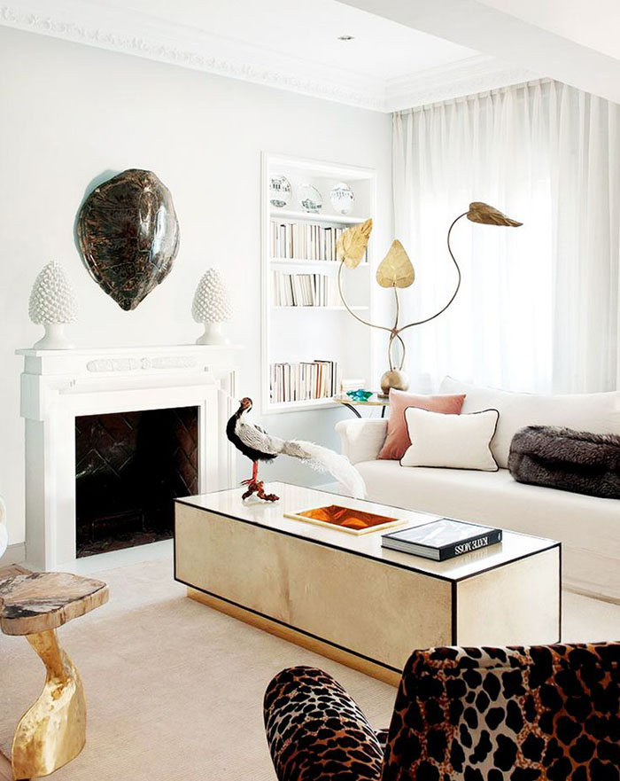
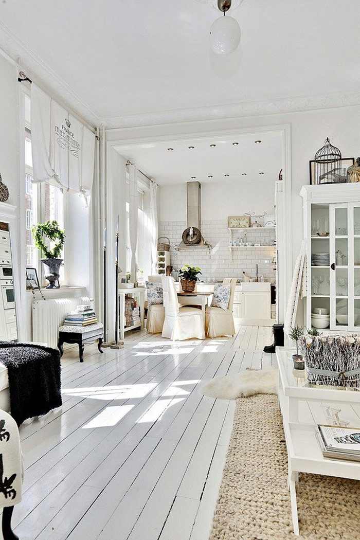
Consistency in wall colours and flooring is something else to keep in mind. When every room is painted a different bold colour, your home will feel more disjointed. Using a neutral, pale palette throughout your home with only slight variations in tone will keep things looking more consistent. The same goes for your flooring – if you use the same flooring throughout, your home will look larger as a result without the chopping up effect that different floor patterns, materials or colours may have.
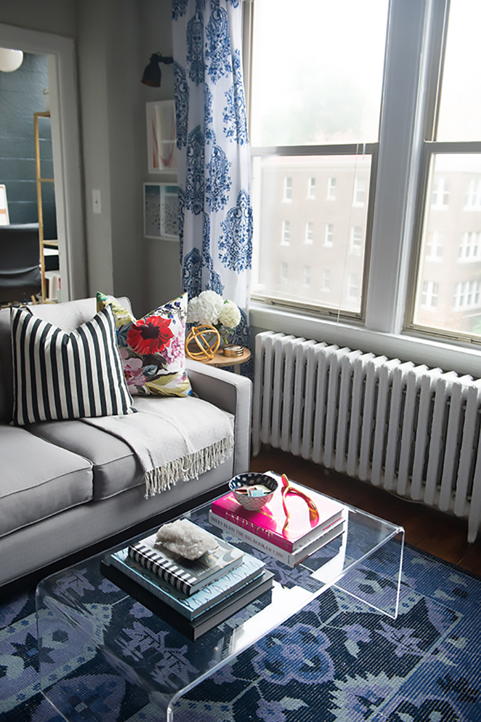
For a fresh approach, why not consider acrylic or Lucite furniture in your room? Using ‘see through’ pieces is another trick to making a space appear larger than it really is. Acrylic furniture can be used to great effect in a smaller room because visually, your eyes do not register it as being there at all. So the room appears to be larger and lighter with less furniture – consider using the now classic Louis Ghost Chair in an office space or dining room and acrylic or glass console tables or coffee tables to give the illusion of more space.
I hope these tips today give you some more ways to expand both visually and functionally the living space you have. Do you live in a smaller space? What have you done to maximise it? Be sure check out our high quality Bahram oak and Rustic oak ranges for all your petite living needs!
Image sources: Lonny / 79 Ideas / Style Me Pretty / The Decorista / Barham Oak / Frency Fancy / Index Ventures / Design Sponge / My Domaine / Planete Deco / Burlap & Lace
About Author - A freelance writer and content marketing expert, Kimberly Duran is an award-winning Interior Design blogger who chronicles her decorating journey in her blog, Swoon Worthy.
